knitr::include_graphics("covid.png")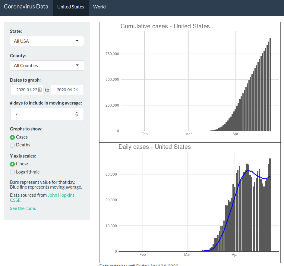
I had been getting frustrated with not being able to quickly find coronavirus data for my area, and not being able to see recent trends without framing and interpretation. So I grabbed down the John Hopkins CSSE data and made a quick Shiny app to visualize case and death rates. I’m trying to not contribute to the constant noise surrounding the ongoing pandemic, but having a way to see these numbers without an overwhelming amount of surrounding editorialization has made me feel like I understand the world a bit better.
knitr::include_graphics("covid.png")
The app lives at this link. Thanks to R Studio, who are providing free hosting for coronavirus apps through the pandemic.